Most Shopify stores get the majority of their sessions from mobile. But mobile conversion rate is usually lower than desktop, often close to half. If you care about conversion rate optimization Shopify, this is the gap worth closing first.
That gap isn’t because mobile shoppers are “just browsing.” It’s usually because mobile adds friction in three places:
This post focuses on the fastest of the three to fix: reach. If you move the key actions into the thumb zone, mobile instantly feels easier and you usually see it show up in add-to-cart and the checkout flow. It’s also a foundational part of Shopify product page optimization and Shopify cart optimization. Now let’s get into the details.
Keep the important stuff:
If your key actions sit top-right, you’re adding friction on every step.
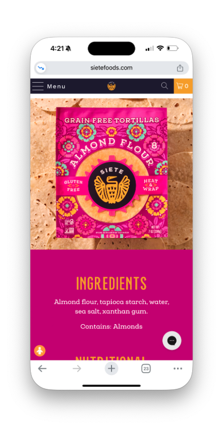
On mobile, the PDP is where most “thumb friction” shows up. If someone has to change grip just to tap “Add to cart,” you’re adding a tiny pause at the exact moment they should be moving forward, and you’ll usually see that show up in add-to-cart rate.
Recommendations:
To keep it from getting messy, only show what matters (CTA, maybe price, maybe selected variant) and don’t stack multiple sticky elements (chat widget, promo bar, sticky CTA). Pick one priority.
The issue often isn't visibility—it's accuracy. When tap targets are too small or too close together, users miss what they're aiming for. Since most people browse with one thumb, your UI needs to account for quick, imprecise taps rather than demand pixel-perfect precision.
Recommendations:
Collection pages are where thumb issues quietly kill momentum. People are scrolling fast, comparing options, and trying to narrow down a list without losing their place. If filtering forces a scroll back to the top, or quick add blocks the product card and causes mis-taps, you create frustration right in the browsing loop.
Recommendations:
Be the first to hear from us and keep in touch.


Let's create a Shopify experience that's built to scale.